As the team’s first embedded UX Designer, I established
a design process within the scrum teams and used it to lead PatientSecure’s first ever re-design.
The new version released to overwhelmingly positive reviews from customers and primary users, and helped the business teams surpass their business metrics of increased upgrades and NRB.
But first -
What exactly does PatientSecure do?
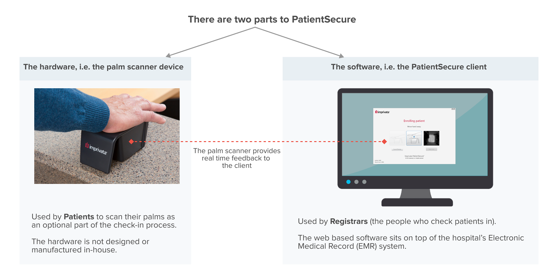
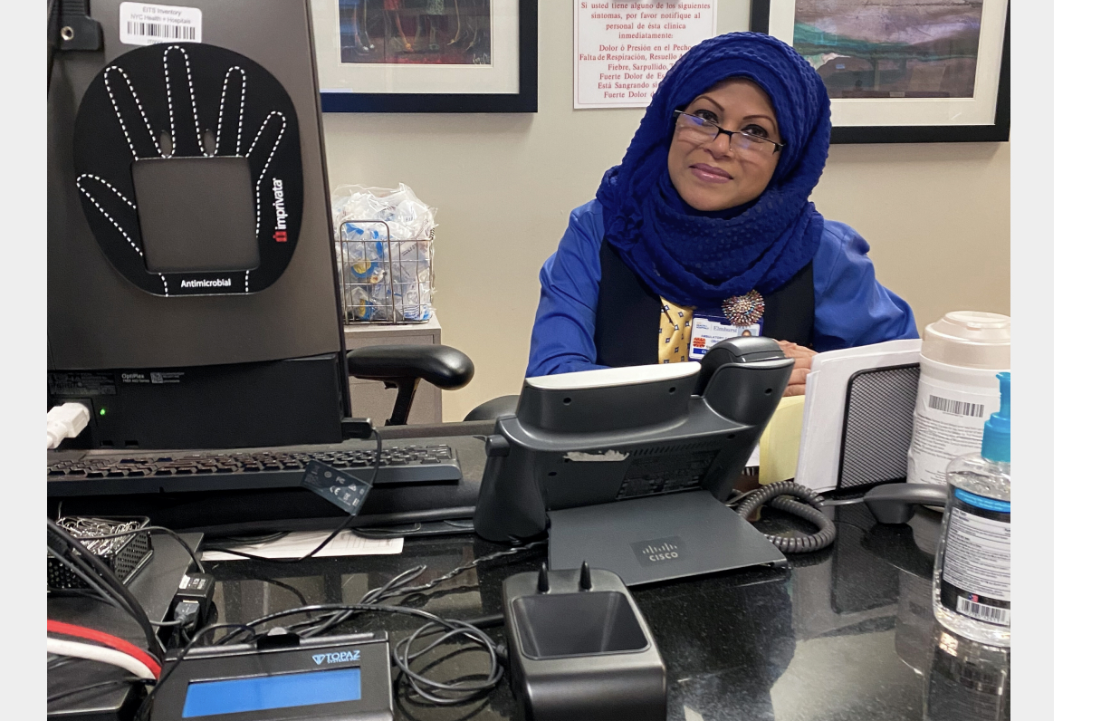
PatientSecure eliminates the risk of patient misidentification and the creation of duplicate records at the health system’s front line, a.k.a. the check-in desks at hospital clinics.
It does this by using palm vein scanning to create a critical one-to-one biometric match between individual patients and their unique digital medical records.
Let’s get to know our users a little better -
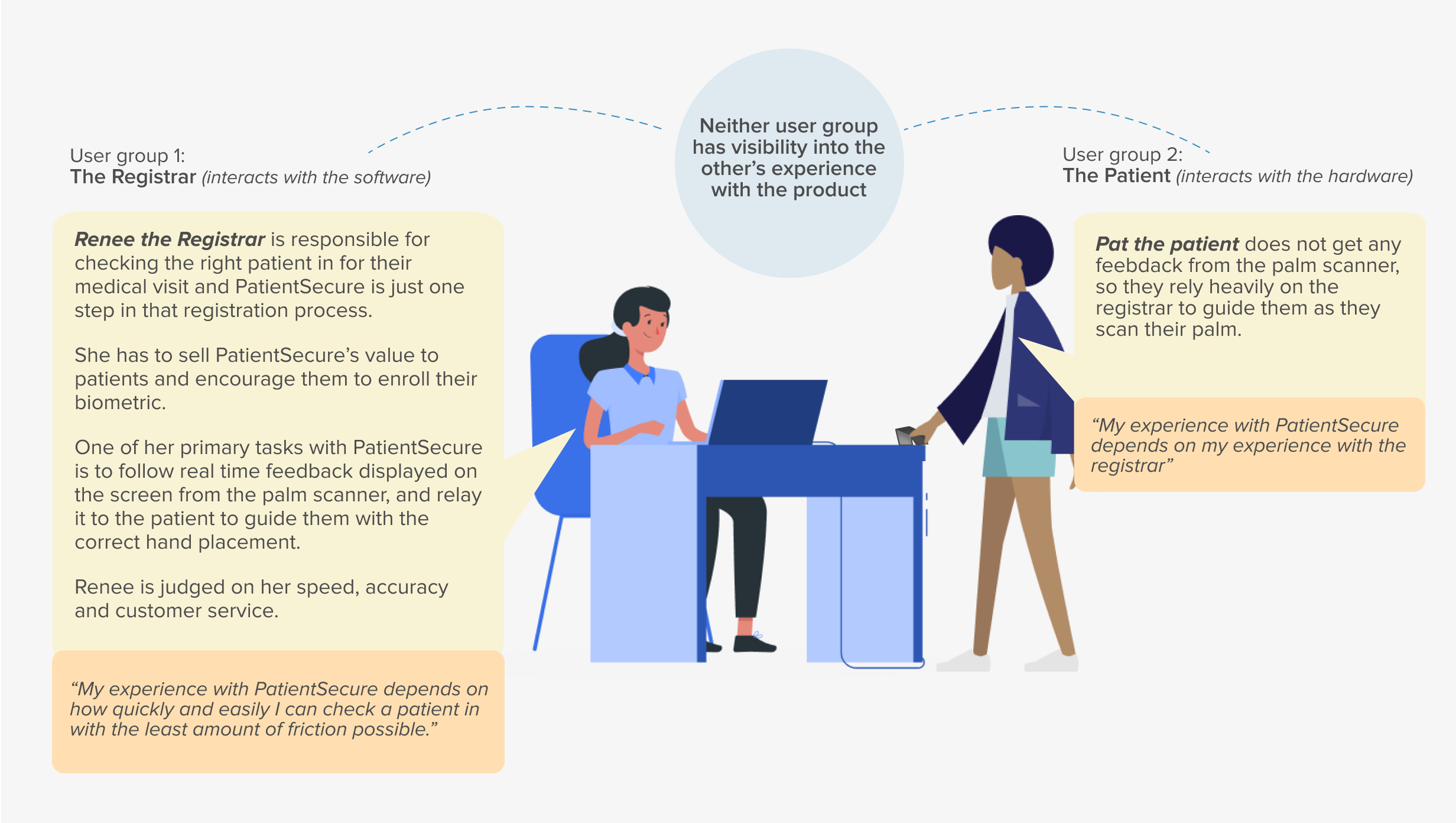
Since the hardware piece was out of scope for this re-design, I saw the Registrar as the Primary Active user and concentrated on her goals and motivations to drive product and design decisions.
The business problem
While our customers’ CIOs, CTOs, CEOs and other upper management had bought into the immense value that PatientSecure could bring to their hospital organization, they were not renewing their licenses or upgrading the software. 90% of our customers had not upgraded in over 3 years.
This was because the actual users of the software – the Registrars (the people that check you in for your medical appointments) didn’t want to use it as a part of the registration process. The general consensus was that the PatientSecure experience was frustrating and unreliable, and made the check-in process longer.
Our customers’ and Imprivata’s unified objective:
Minimize misidentification during the registration process
Reduce the creation of duplicate patient records
How do our customers do that?
By increasing PatientSecure usage at registration desks
How do we help our customers reach their goal?
Create an environment that promotes PatientSecure usage.
Go from registrars refusing to use PatientSecure to them can’t living without PatientSecure.
The Re-design process
I collaborated with different stakeholders to develop a research strategy to help us understand the current challenges in the experience, identify areas for improvement and also help product management and development get alignment on the scope of the project.
During this re-design process I also established a UX design and research process within the scrum teams for the first time in PatientSecure’s engineering history
1. Discover
Review of existing research
I started by digging through previous research studies and uncovered evidence of common user struggles like frustrations around clunky
workflows and unhelpful UI.
It was clear that registrars were not motivated to use a time consuming solution that they themselves did not benefit from.

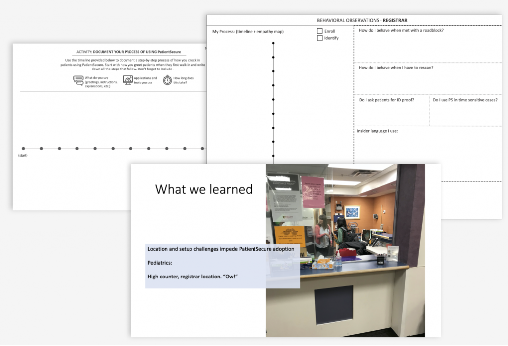
Ethnography Research & User Interviews
My manager and I visited one of our customers, University of Utah Health on-site in Salt Lake City and co-conducted an ethnography study and multiple user interviews over 3 days.
I designed the research framework, analyzed our findings into actionable insights and presented them to the cross-functional team.
I used these invaluable insights to consistently advocate and build empathy for the user throughout the re-design process.
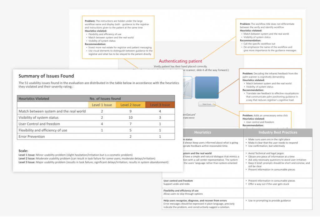
In-depth heuristic evaluation of the legacy UI
I mapped the findings from the in-depth evaluation of the legacy UI to the insights we uncovered from the research study in Utah.
This helped me identify the usability issues that attributed to the registrar’s negative experience with PatientSecure and identify areas for improvement in the product. This helped PM and development to visualize the scope of the release.
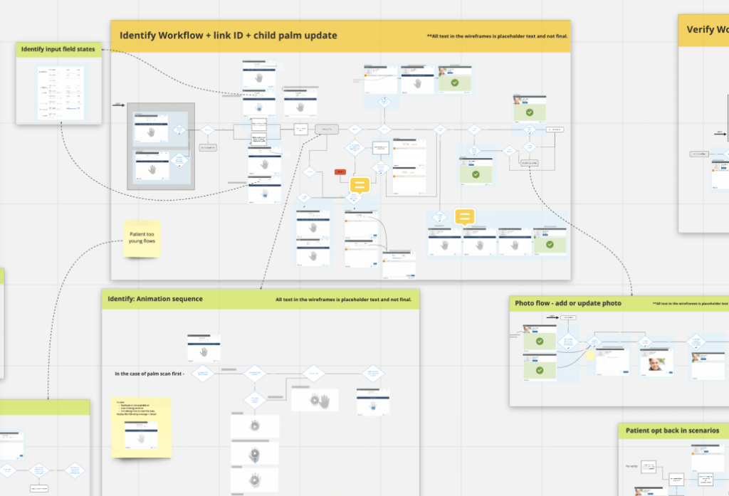
Mapping out workflows
I worked with Engineering to map out the primary, secondary and tertiary
workflows of all the user scenarios.
These workflows served as the source of truth for QE testing, helped both scrum teams align on key decisions and helped me identify screen elements.
2. Identify Design Goals
I triangulated the insights from the Discovery process with the immediate business goals to develop goals for the re-design. These goals served as my pilars and kept me honest throughout the design process.
Business goal:
Give the registrar the illusion that using PatientSecure is a breeze and makes the registration process easier
Design goals:
- The UI should be consistent and easily scannable
- Happy paths should be effortless
- Leverage existing patient data in the EMR to simplify workflows and reduce Renee’s cognitive load
- Significantly reduce the need for Renee to divide her attention between the patient, the scanner and the software
- Significantly reduce the need for Renee to pogo-stick between the PatientSecure client and the EMR
-
Business goal:
Make the registrar trust PatientSecure and believe in it enough to be an advocate for usage
Design goals:
- Presentation effect - significantly improve the visual design of the client to help establish and build trust
- Provide helpful visual and text guidance to help Renee efficiently complete her tasks
- Be more forgiving
- Clearly communicate the system status to Renee and offer suggestions to troubleshoot
- Provide helpful guidance when she chances upon an unhappy path
3. Design and Analysis
I brainstormed on the new and improved PatientSecure client over a process of iterative wireframing, critique workshops, various feedback loops with PM, Dev, Customer success, customer design partners and usability sessions with users on the off chance I had access to them.
The Improved Experience
Re-designing the client skeleton
My first design task was to re-design the hierarchy and information architecture of the skeleton and reskin the visual design, as that would provide the base for the overall re-design.
One of our primary design goals was to make the client visually appealing to Renee in the hope that the re-designed aesthetics along with key workflow and feature improvements will give her the feeling that PatientSecure is trustworthy and there to make her life easier.
Original Experience
"PatientSecure just looks and feels so out-dated"

Improved Experience
The client was resized to help reduce the background clutter from other applications open on Renee’s desktop

To help reduce Renee’s cognitive load while context switching, I re-worked the spatial and information hierarchy in a way that mimiced the order of her interactions with the patient. This also simplifies scanning considerably so Renee can scan through the UI and only focus on the most relevant information or feedback.
[popup_anything id=”217816″]
THE IMPACT
“I like the new look, it’s snazzy! The palm is bigger and the whole set up is bigger… that helps, some staff members have an issue seeing everything.
– Participant D, Usability testing with Parkland Memorial Hospital, Dallas
Once the spatial architecture of the client was defined, I shifted my focus to address the usability issues in the legacy UI that were directly tied to the users and customers challenges with PatientSecure.
Original Experience
Simple workflows are cognitively demanding due to the many disruptions caused by unnecessary pop-ups and avoidable clicks.
Improved Experience
On a happy path Renee has to only click once - to close PatientSecure at the end of the workflow.
[popup_anything id=”217877″]
THE IMPACT
- “That’s a great fix because entering both the full name and date of birth is slowing us down a little bit so this streamlines it and is extremely helpful.”
Participant A, Usability testing with Parkland Memorial Hospital, Dallas
- Our users and customers appreciated the improved user experience and the overall feel of the product. Users of the legacy client called it easy breezy.
- The internal sales and marketing teams were very excited with the new release and couldn’t wait to get on the road because they believed it would bring on a financially transformative quarter for PatientSecure sales.
Original Experience
The UI demands a lot of her attention and makes it challenging for her to repeatedly shift focus from the screen to the patient’s hand on the palm scanner.
Improved Experience
Provides clear text guidance as well as strong visual cues for the palm placement guidance to allow for side view focus.
THE IMPACT
- “Animations are understandable, easy to follow, they’ll help a lot because most times we don’t understand why the patient is not getting scanned. I actually really like the “move palm forward animation”. It’s much more efficient than just words.”
Participant F, Usability testing with Parkland Memorial Hospital, Dallas
- The quality of enrollment scans improved significantly after this release and alleviated a lot of the customer’s issues as well as workflow issues related to poor quality enrollments. The promise of improved enrollment scans encouraged older customers to upgrade.
Original Experience
Key workflows are disruptive because they require pogo-sticking between the EMR and PatientSecure
Improved Experience
Leverages existing back-end data to simplify switching between workflows without leaving the PatientSecure client
THE IMPACT
- ”Ok, I like that. I like that a lot. I definitely like the fact that it takes you right into verify when the patient is already enrolled… that’ll make it a lot faster”
Participant A, Usability testing with Parkland Memorial Hospital, Dallas
- This workflow exponentially increased PatientSecure usage in the Cardiology department at Parkland Memorial Hospital where 90% of their patients were already enrolled in PatientSecure.
- All five customers that were given a demo of this workflow said they couldn’t wait to upgrade. Two of them offered to have it set up in their test environment immediately after the demo.
Original Experience
Print outs of the benefits of PatientSecure placed on an already crowded desk
Improved Experience
A dropdown that displays customized text written by the hospital management about the benefits of PatientSecure
THE IMPACT
- ”This is excellent for new registrars. After a point, you memorize the words and don’t need it anymore and it’s perfect that it’s not in
your way when that happens”
Participant B, Usability testing with Parkland Memorial Hospital, Dallas
- ”That’d be great, we are trying to streamline everything anyway, so the fact that we could add a script is perfect”
Registration Supervisor, NWJ Barnabas
- Since the introduction of this feature was a direct product of the UX research study I conducted, the UX team got a lot of traction within the engineering and sales organizations at Imprivata.
Existing Experience
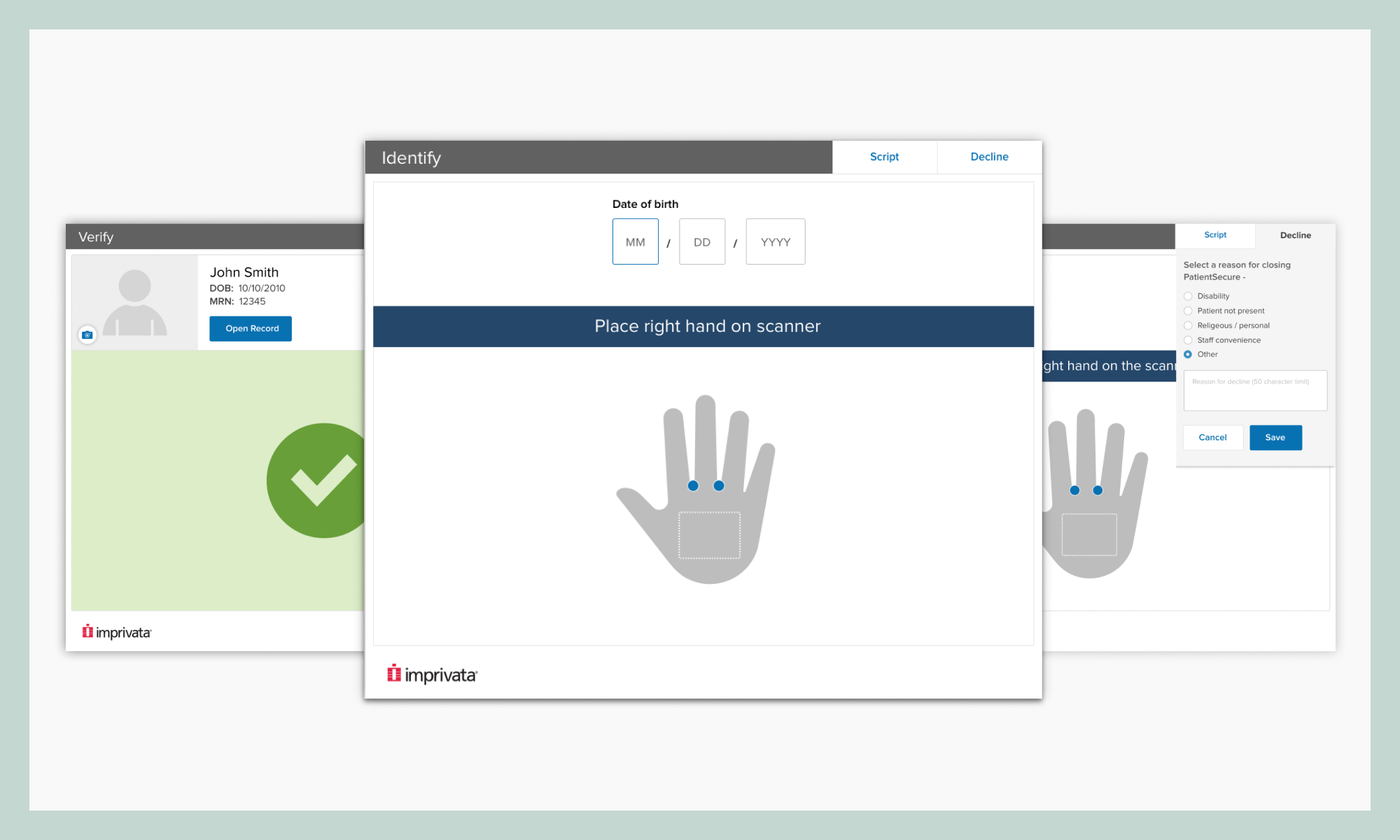
At hospitals that strictly mandate PatientSecure and reprimand registrars for not using it, registrars are made to manually note down the reason why they didn’t use PatientSecure to check a patient in. The supervisor then collects these resports and investigates them over time.

Improved Experience
A dropdown that allows Renee to select a reason for closing PatientSecure. These reasons are tracked for every registrar in an “Opt-Out Report” which can be downloaded from the PatientSecure Admin Console.
THE IMPACT
- ”Perfect. That is the perfect solution there. I have had patients refuse to use it for religious reasons. Being able to mention that as a reason will be great”
Participant D, Usability testing with Parkland Memorial Hospital, Dallas
- Some registrars commented that having to always select a reason can be annoying, especially if they opened PatientSecure by mistake and want to just get out of it quickly to get back to their workflow. We decided to release this feature as is since the customer’s needs outweighed the user challenge, but agreed to monitor its usability in the wild.
Reflections
This re-design was pivotal in PatientSecure’s journey. It laid the groundwork for multiple future iterations that continued to address user needs and the changing requirements of the healthcare industry.
I learned a tremendous lot while working on the re-design, most of all
– How to navigate ambiguity and respond to changing requirements
– How to creatively solicit feedback when I don’t have access to users,
– How to negotiate “expensive ux improvements” with engineering
– How to advocate for myself, for design and for the users in a very engineering-dominated environment
– How to form a strong alliance with engineering and product management to be a successful designer
To significantly improve the experience of a product I deeply believe in was a very fulfilling experience, something that was lacking in my previous career.